

Key Points
- Dynamic LCP Element Inconsistency triggers fragmented performance signals in Google’s mobile-first index when desktop and mobile viewports identify different DOM nodes.
- CSS-based display toggles and conditional server-side rendering often force the browser to recalculate LCP, promoting late-loading text blocks or secondary images.
- Mitigation strategy requires HTML5 picture element implementation, viewport-specific preload hints, and critical CSS alignment to unify LCP candidates across devices.
Table of Contents
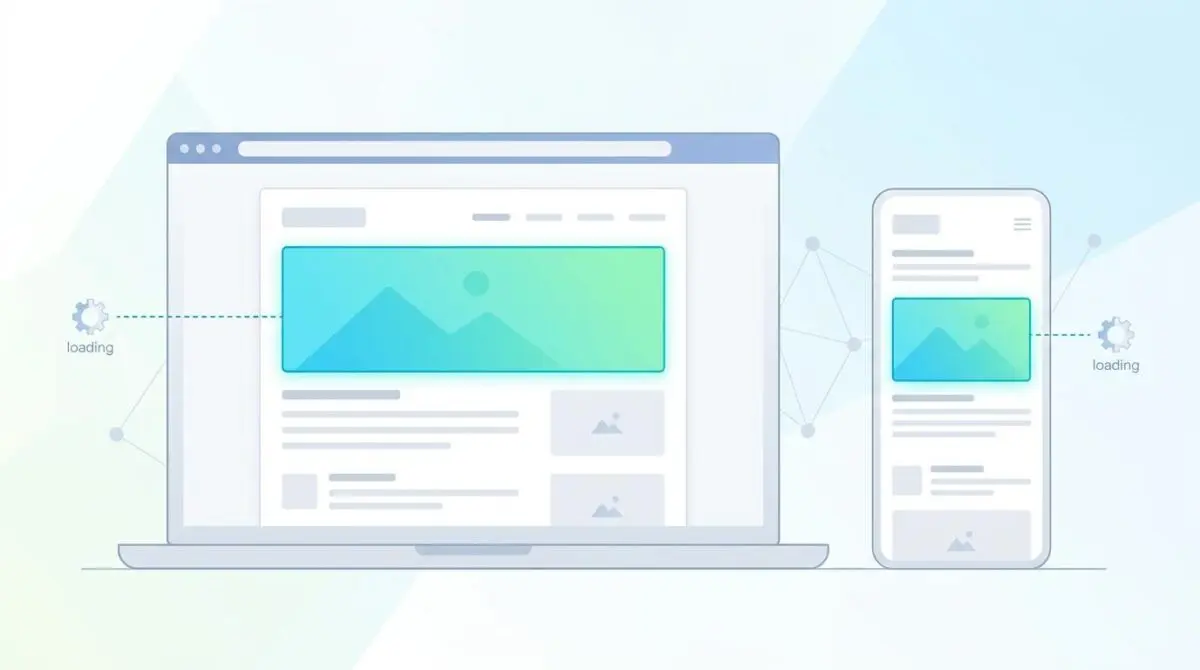
The Core Conflict: Viewport Desynchronization
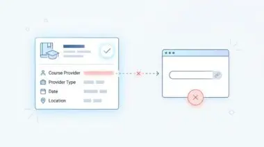
According to recent industry performance reports, over 38% of enterprise WordPress sites suffer from LCP regression caused by dynamic element swaps. In these scenarios, the mobile LCP element is often identified as a text block that loads significantly slower than the desktop’s optimized hero image.
This phenomenon is the hallmark of Dynamic LCP Element Inconsistency. It occurs when the browser identifies entirely different Document Object Model nodes as the Largest Contentful Paint across various device viewports.
Responsive design patterns automatically activate when the viewport resizes. If these patterns are poorly executed, they completely destroy the predictability of your page load timeline.
Search engines rely heavily on consistent rendering paths to allocate crawl budget efficiently. When dynamic element swaps occur, search bots waste valuable processing power recalculating layout shifts and re-evaluating primary content nodes.
In Google Search Console, this typically manifests as an LCP issue exceeding 2.5 seconds on mobile, while the desktop report remains completely green. From a technical SEO perspective, this creates heavily fragmented performance signals.
Google’s mobile-first indexing engine evaluates LCP independently per device-type user agent. LCP evaluates the largest element visible in the specific device viewport, meaning a perfect desktop experience cannot save a penalized mobile page.
In raw server logs, you may notice Googlebot-Mobile frequently requesting smaller image assets while Googlebot-Desktop requests high-resolution variants. Consequently, the Google Search Console Origin Summary will display a significant delta in LCP timings between the two viewports.
Diagnostic Checkpoints
When investigating viewport optimization conflicts, the root cause is almost always a deep desynchronization within the rendering stack.
Diagnostic Checkpoints
Responsive Image Display Logic (CSS-based)
CSS-hidden images force browser to promote secondary LCP elements.
Conditional Server-Side Rendering (wp_is_mobile)
Server-side UA detection disrupts pre-parsing of critical image resources.
JavaScript-Injected Hero Content
Client-side rendering delays LCP on resource-constrained mobile devices.
Font-Display Swap Latency
Text-based LCP timing depends on custom web font availability.
Developers frequently rely on CSS properties to hide large desktop hero images on mobile devices. While the image is visually suppressed, the browser still initiates the underlying fetch sequence.
Because the hidden image cannot serve as the LCP element, the browser is forced to hunt for a secondary candidate. This behavior often promotes a late-loading text block or a secondary image to LCP status.
The browser’s Preload Scanner is designed to look ahead in the document and fetch high-priority resources early. When developers hide elements via CSS, the scanner still sees the image tag and requests it, even though the rendering engine later discards it from the visual viewport.
WordPress themes utilizing page builders often allow users to hide elements on mobile viewports. This action does not remove the element from the DOM. It merely suppresses visual rendering, which exacerbates the hunt for the next largest candidate.
Server-side functions also contribute heavily to this desynchronization. By altering the HTML structure before it reaches the browser, conditional rendering prevents the Preload Scanner from identifying the correct resource early.
Plugins managing caching may inadvertently store the desktop version of a page and serve it to mobile users. This leads to a frustrating situation where the LCP element is present in the code but remains unoptimized for the specific viewport.
Headless setups face similar hurdles with JavaScript-injected hero content. On resource-constrained mobile devices, delayed client-side execution causes the LCP element to shift from a placeholder to the actual content, artificially inflating the final metric.
Furthermore, hydration mismatches in React or Vue applications create similar rendering chaos. The LCP element identified by the server differs entirely from the one ultimately rendered by the client.
Finally, WordPress sites using Google Fonts may experience LCP shifts if the swap property causes the text block size to fluctuate during the render phase. In these cases, text-based LCP timing becomes entirely dependent on custom web font availability.
The Engineering Resolution
Resolving Dynamic LCP Element Inconsistency requires a highly unified approach to DOM architecture.
Engineering Resolution Roadmap
Identify LCP Discrepancy
Open Chrome DevTools > Performance Tab. Run a profile for both ‘Moto G Power’ (mobile) and ‘Desktop’ presets. Locate the ‘LCP’ marker in the ‘Timings’ row and click the ‘Related Node’ in the ‘Summary’ tab to confirm if the elements differ.
Implement Picture-Based Responsive Hero
Modify the template file (header.php or front-page.php) to use the <picture> element. This ensures the same logical LCP element exists across all viewports while serving optimized dimensions. Use the ‘fetchpriority’ attribute on the <img> tag within the <picture> block.
Inject Preload Hints with Media Queries
Add dynamic preload links to the <head> section using ‘imagesrcset’ and ‘imagesizes’ to ensure the browser’s Preload Scanner prioritizes the LCP image before CSS is even parsed. Example: <link rel=’preload’ as=’image’ href=’mobile-hero.jpg’ imagesrcset=’mobile-hero.jpg 600w, desktop-hero.jpg 1200w’ imagesizes=’100vw’>.
Configure Critical CSS for Viewport-Specific LCP
Use a tool like ‘Autoptimize’ or ‘Jetpack Boost’ to generate viewport-specific Critical CSS. This ensures that whatever element is the LCP on mobile (even if it is text) is rendered immediately without waiting for the full stylesheet.
The primary objective is to ensure that the exact same logical LCP element exists across all viewports. This prevents the browser from recalculating the largest visible node during the critical rendering path.
By transitioning to a picture-based responsive hero, you provide the browser with explicit instructions on which asset to load based on viewport dimensions. This effectively eliminates the guesswork inherent in CSS-based display toggles.
Furthermore, injecting dynamic preload hints ensures the Preload Scanner prioritizes the LCP image before the CSS is even parsed. This technique is highly effective when combined with viewport-specific Critical CSS generation.
Resolution Execution: Unifying the DOM
To completely eliminate viewport desynchronization, you must refactor the hero section directly at the template level.
Fixing via HTML and Media Queries
Modify your template files to utilize the HTML5 picture element. This modern structure allows you to serve optimized dimensions while maintaining a consistent LCP candidate across all devices.
Ensure you boost the priority of the LCP image by applying the fetchpriority=”high” attribute directly to the fallback image tag. This signals the browser to allocate maximum bandwidth to the asset immediately upon discovery.
This specific attribute is a powerful tool in your optimization arsenal. It effectively overrides the browser’s default heuristic for resource fetching.
By applying it strictly to the desktop fallback image within the picture tag, you guarantee maximum bandwidth allocation. Avoid applying this attribute to multiple elements, as doing so will dilute its effectiveness and confuse the rendering engine.
<picture>
  <source media="(max-width: 799px)" srcset="hero-mobile.webp">
  <source media="(min-width: 800px)" srcset="hero-desktop.webp">
  <img src="hero-desktop.webp" fetchpriority="high" alt="Hero LCP Element" width="1200" height="630">
</picture>
Validation Protocol & Edge Cases
Once the DOM architecture is updated, rigorous validation is required to ensure the correct headers and resources are served.
Validation Protocol
- Run Google Search Console ‘URL Inspection Tool’ live test to identify nodes.
- Inspect ‘Page Resources’ and screenshots to ensure images are not blocked.
- Use CURL with a mobile User-Agent string to verify responsive headers.
When executing CURL commands, ensure you test multiple mobile user agents to cover various device profiles. Carefully inspect the response headers for the presence of the correct Vary header.
This instructs intermediate caches that the content varies based on the user agent, preventing stale desktop assets from serving to mobile users. In Google Search Console, the Page Resources tab will reveal if any critical CSS or image files are blocked by overly aggressive robots.txt directives.
Be aware of edge cases in heavily cached environments. In a Cloudflare-heavy setup utilizing Polish or Mirage, the CDN might dynamically swap LCP images for WebP or AVIF versions based on network conditions.
If Cloudflare Edge Workers are simultaneously rewriting HTML to inject lazy loading, they might accidentally target the mobile LCP element while ignoring the desktop version. This creates a massive LCP spike exclusively for mobile users, despite the origin server being perfectly optimized.
Verify the fix by using the Google Search Console URL Inspection Tool and clicking Test Live URL. Check the Screenshot and Page Resources to ensure no LCP-related images are blocked by restrictive firewall rules.
Autonomous Monitoring & Prevention
Preventing LCP regression requires proactive monitoring within your continuous integration pipeline. Implementing a Performance Budget using tools like Lighthouse CI ensures that builds fail if the mobile LCP candidate differs from the desktop version.
Additionally, deploying Real User Monitoring via the Web Vitals JS library allows you to track element-timing attributes in the wild. This captures real-world shifts that controlled lab data might miss entirely.
For enterprise environments, integrating advanced automation through Make.com pipelines or custom API alerts is the ultimate way to monitor entity integrity. Partnering with Andres SEO Expert ensures your architecture remains resilient against these deep-level crawl anomalies.
Conclusion
Resolving Dynamic LCP Element Inconsistency is critical for maintaining robust performance signals across all viewports. By unifying the DOM and prioritizing resource delivery, you safeguard your mobile-first indexing status.
Navigating the intersection of technical SEO, server architecture, and generative search requires a precise roadmap. If you need to future-proof your enterprise stack, resolve deep-level crawl anomalies, or implement AI-driven SEO automation, connect with Andres at Andres SEO Expert.
Frequently Asked Questions
What is Dynamic LCP Element Inconsistency?
Dynamic LCP Element Inconsistency occurs when the browser identifies different Document Object Model (DOM) nodes as the Largest Contentful Paint across different device viewports. This typically happens when responsive design patterns swap elements, such as replacing a desktop hero image with a mobile text block, which fragments performance signals and can lead to SEO penalties.
Why does my mobile LCP fail while desktop remains green?
This discrepancy is often caused by viewport desynchronization where the mobile LCP candidate is less optimized than the desktop version. Common culprits include hiding desktop hero images via CSS (which the browser still fetches) or using server-side logic that delays the rendering of primary mobile content compared to the desktop layout.
Does using CSS display:none on a hero image stop it from loading?
No, the browser’s Preload Scanner identifies and initiates the fetch for image tags even if they are hidden via CSS “display: none”. While the hidden image won’t be counted as the LCP element, it still consumes bandwidth, and the browser is forced to find a secondary, often slower, candidate for the LCP metric.
How do I fix LCP desynchronization between devices?
The most effective engineering resolution is to refactor your hero section using the HTML5 <picture> element. This ensures that the same logical node remains the LCP candidate across all viewports while allowing you to serve device-optimized image dimensions. Additionally, applying the fetchpriority=”high” attribute helps signal immediate priority to the browser.
What is the benefit of using preload hints with imagesrcset?
Injecting dynamic preload links with imagesrcset and imagesizes in the document <head> allows the browser to identify and prioritize the correct viewport-specific LCP image before the CSS is even parsed. This significantly reduces the time to first paint for the LCP element, especially on slower mobile connections.
Can CDN edge workers impact my mobile LCP metrics?
Yes, edge workers or caching layers can inadvertently cause LCP spikes if they serve desktop-cached HTML to mobile users or if they apply lazy-loading scripts to the mobile LCP element while ignoring the desktop version. It is vital to use the “Vary: User-Agent” header to ensure caches distinguish between different device-type requests.