


Key Points
- Server-side mobile detection logic severs link equity by delivering a stripped DOM payload to Googlebot-Mobile.
- JavaScript-injected navigation menus require interaction, rendering critical internal links invisible during the initial crawl phase.
- Achieving Mobile-First Indexing Parity requires flattening mobile navigation and utilizing CSS media queries instead of conditional rendering.
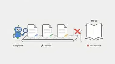
What is the ‘Mobile-First Indexing Parity’ Error?
Mobile-First Indexing Parity refers to the strict technical requirement that the mobile version of a website must maintain the exact same primary content, structured data, and internal linking architecture as its desktop counterpart.
When Googlebot-Mobile encounters a different crawl depth than Googlebot-Desktop, it indicates a severe structural discrepancy within the Document Object Model. This means critical internal links are either missing entirely, hidden behind interactive elements, or buried significantly deeper within the mobile DOM hierarchy.
These architectural discrepancies almost always stem from responsive design compromises or mobile-specific user interface elements. For example, developers frequently utilize hamburger menus or accordions to save screen real estate, inadvertently stripping out the raw anchor tags that crawlers rely on for discovery. Consequently, this desynchronization wastes your allocated Crawl Budget and directly harms your overall ranking potential.
Furthermore, modern search algorithms and Generative Engine Optimization models rely heavily on consistent entity mapping. When your mobile and desktop architectures diverge, the knowledge graph becomes fractured. Google evaluates the mobile payload as the primary source of truth, meaning any links missing from the mobile DOM effectively cease to exist in the index.
Symptom Validation
The most glaring symptom of this parity error manifests directly within the Google Search Console ‘Crawl stats’ report. By filtering the report by Googlebot Smartphone, you will typically observe a significantly higher average click depth compared to desktop crawlers. This statistical divergence indicates that Googlebot-Mobile is expending more computational resources to discover the exact same content.
Additionally, you may notice a persistent ‘Discovered – currently not indexed’ status for deep-level pages. These are often pages that are easily reachable via the desktop mega-menu but remain seemingly orphaned on the mobile viewport. Because the mobile crawler cannot find a direct path, the URLs are queued but ultimately abandoned due to crawl budget limitations.
Server log analysis provides the final layer of symptom validation. By parsing your access logs, you can trace the exact path taken by different User-Agents. Logs will frequently show Googlebot-Mobile traversing four to five levels of pagination, redirects, or contextual internal links to reach a URL that Googlebot-Desktop accesses in just two hops from the homepage.
Diagnostic Checkpoints: Identifying the Root Cause
This crawl depth error is fundamentally a symptom of desynchronization within your technical stack. When the mobile and desktop experiences diverge at the code level, crawlers receive conflicting signals about your site’s hierarchy and topical clusters.
Before changing any code, we must isolate the specific layer causing the conflict. Adopting a strict troubleshooting mindset ensures we identify whether the issue lies in server-side logic, client-side rendering, or CSS styling.
Diagnostic Checkpoints
Conditional DOM Rendering (wp_is_mobile)
Server-side detection strips critical internal links for mobile crawlers.
JavaScript-Injected Navigation
Mobile menu links require interaction and remain invisible to Googlebot.
CSS ‘Display: None’ De-prioritization
Hidden links suffer from increased crawl depth and weight loss.
Conditional DOM Rendering (wp_is_mobile)
The server often uses User-Agent detection to serve entirely different HTML payloads based on the requesting device. If the mobile payload explicitly excludes sidebars, footers, or mega-menus that are present on desktop, the link equity and discovery paths are instantly severed for the mobile crawler. The server is essentially making a unilateral decision to withhold data from Googlebot-Mobile.
In a WordPress context, themes or plugins frequently utilize the wp_is_mobile() function to optimize performance. The intention is to reduce the Time to First Byte by stripping out heavy navigation elements for mobile users. Unfortunately, this performance optimization inadvertently strips those critical crawling pathways, blinding the search engine to your deeper site architecture.
JavaScript-Injected Navigation
Many modern mobile menus require a user click event to inject links into the Document Object Model. While Googlebot possesses the Web Rendering Service to execute JavaScript, it does not interact with the page, scroll, or click buttons. If links are not present in the initial HTML or rendered automatically upon the DOMContentLoaded event, they remain completely invisible to the crawler.
This issue is highly prevalent in headless architectures or React-based WordPress themes. In these environments, the mobile hamburger menu content is often fetched via an asynchronous API call only after user interaction. Because the crawler never triggers the event listener, the API call never fires, and the internal links are never injected into the crawlable payload.
CSS ‘Display: None’ De-prioritization
While Googlebot can technically parse content hidden via CSS, it processes this data differently than visible, above-the-fold content. The crawler’s rendering engine may assign lower weight or calculate a higher crawl depth for links that are not visible in the default mobile viewport. This penalty is exacerbated if those hidden links are physically moved to the bottom of the DOM structure.
Responsive CSS frameworks, such as Bootstrap or Tailwind, are frequently used in WordPress themes to manage visual clutter. Developers often apply classes that trigger display: none on secondary navigation elements for small screens. While this improves the human user experience, it inadvertently de-prioritizes those links in the eyes of the search engine, increasing the perceived crawl depth.
Engineering Resolution Roadmap
Resolving mobile crawl depth discrepancies requires a systematic approach to unifying your DOM architecture. The ultimate engineering goal is to ensure that Googlebot receives the exact same structural map of your website, regardless of the User-Agent it employs during the crawl.
Engineering Resolution Roadmap
Audit DOM Parity
Use the Chrome DevTools ‘Inspect’ tool in ‘Dimensions: Responsive’ mode. Compare the number of <a> tags in the source code between Desktop and Mobile viewports. Ensure all critical internal links exist in both.
Remove Server-Side Mobile Detection
Search the codebase for wp_is_mobile() or $_SERVER[‘HTTP_USER_AGENT’] logic. Replace these with CSS Media Queries to ensure the same HTML is delivered to all devices.
Flatten Mobile Navigation
Modify the mobile menu to ensure it is present in the HTML source on page load. Use visibility: hidden or opacity: 0 instead of display: none if the links must be hidden from view but remain in the crawlable DOM.
The first step is auditing DOM parity using the Chrome DevTools suite. By inspecting the source code in ‘Dimensions: Responsive’ mode, you can directly compare the total number of anchor tags between desktop and mobile viewports. Ensuring all critical internal links exist in both versions is the foundational requirement for indexing parity.
Next, you must systematically eliminate server-side mobile detection logic from your application layer. Searching your codebase for wp_is_mobile() or $_SERVER[‘HTTP_USER_AGENT’] allows you to identify exactly where the HTML payload is being fragmented. Replacing these PHP functions with CSS Media Queries guarantees that the same comprehensive HTML document is delivered to all devices, shifting the rendering burden to the client’s browser.
Finally, flattening the mobile navigation ensures links are accessible without requiring user interaction. Modifying the mobile menu to be present in the raw HTML source on page load is critical for crawler discovery. If links must be visually hidden to maintain UI integrity, utilizing visibility: hidden or opacity: 0 is vastly superior to display: none, as it keeps the links firmly within the crawlable DOM tree.
The Code Fix
The following PHP snippet forces WordPress to render the primary navigation menu consistently, bypassing any conditional mobile logic built into the theme. By hooking into the wp_nav_menu_args filter within your functions.php file, we ensure the fallback callback always delivers the full page menu. Additionally, the provided bash command allows you to parse your access.log to monitor Googlebot-Mobile’s crawl behavior and verify the reduction in crawl depth.
add_filter( 'wp_nav_menu_args', function( $args ) {
    // Ensure the 'Main Menu' is always rendered in full,
    // regardless of device, to maintain link parity.
    if ( $args['theme_location'] === 'primary' ) {
        $args['fallback_cb'] = 'wp_page_menu';
    }
    return $args;
} );
// Regex for log analysis: grep 'Googlebot-Mobile' access.log | awk '{print $7}' | sort | uniq -c
Validation Protocol & Edge Cases
Once the engineering fixes are deployed to your production environment, you must verify the resolution immediately. Waiting for Googlebot’s next natural crawl cycle leaves your site vulnerable to prolonged indexing issues. Proactive validation ensures that the mobile payload now contains the complete, unfragmented internal linking structure.
Validation Protocol
- Execute cURL with Googlebot-Mobile User-Agent to verify HTML payload parity.
- Launch Google Search Console URL Inspection for targeted deep pages.
- Audit ‘Tested Page’ HTML tab to confirm DOM link presence.
- Validate mobile navigation links are accessible without user interaction.
However, standard architectural fixes may occasionally fail due to edge case scenarios involving aggressive caching or edge computing layers. A common conflict arises when Cloudflare’s Rocket Loader or Mobile Redirect edge functions intercept incoming requests. These edge workers can alter the payload before it ever reaches the client.
In these instances, Cloudflare may serve a ‘lite’ version of the HTML from the edge cache that lacks the full navigation suite. Even if your origin server is correctly configured for parity, the edge cache desynchronization will continue to feed Googlebot a fragmented DOM. You must purge all edge caches and configure specific page rules to bypass mobile-specific caching for known search engine User-Agents.
How to Prevent Future Issues & Best Practices
Preventing future indexing parity issues requires integrating automated SEO checks directly into your development workflow. Implementing a Continuous Integration and Continuous Deployment pipeline check is the most robust defense. Using a headless browser framework, such as Playwright or Puppeteer, allows you to automatically count internal links on both mobile and desktop viewports before any deployment goes live.
Furthermore, you should establish a routine for monitoring the Google Search Console ‘Crawl Stats’ report. Specifically filtering this data by the ‘Googlebot Smartphone’ agent will provide early warning signs of depth discrepancies. Catching these statistical anomalies early prevents them from cascading into widespread deindexing events.
As a fundamental best practice, engineering teams must always default to responsive design principles over adaptive, server-side rendering. Relying strictly on CSS media queries to handle visual presentation ensures that the underlying HTML structure remains robust. This philosophy guarantees that your site architecture remains consistent, fully crawlable, and optimized for all device types.
Think of your website’s internal linking as a city’s subway system. Desktop users get the master map showing every station and transfer line. But if you use conditional mobile rendering, you are handing Googlebot-Mobile a tourist map that only shows the major hubs. The crawler hasn’t lost its ability to navigate; you’ve simply hidden the tracks. Mobile-First Indexing Parity is about ensuring every crawler gets the exact same master map, regardless of the vehicle they arrived in.
Decoding Mobile-First Indexing Parity: The Ghost in the Generative Machine
Technical debt within your Mobile-First Indexing Parity creates severe semantic noise that actively confuses generative response engines like ChatGPT, Gemini, and Perplexity.
These LLM-based models rely on crawling consistent, structured pathways to understand entity relationships and topical authority. When your mobile DOM lacks the internal links present on desktop, it fractures the knowledge graph.
This data inconsistency prevents generative engines from synthesizing accurate information, causing them to drop your brand from AI-driven answers entirely.
Maintaining a clean stack is no longer just an SEO best practice; it is vital for survival in the Generative Engine Optimization (GEO) ecosystem. As search transitions from traditional indexing to real-time AI synthesis, manual audits are dead. Autonomous monitoring is now mandatory.
Surviving this shift requires engineering real-time SEO pipelines. Utilizing Make.com to orchestrate these autonomous systems is the inevitable future of technical search.
For example, an enterprise-grade pipeline can leverage a Headless Browser API (like ScrapingBee or Browserless) to simultaneously fetch a URL simulating both an iPhone user-agent and a Desktop environment.
By extracting and comparing the raw anchor tags from both Document Object Models, the system instantly detects DOM desynchronization. If a discrepancy is found, the pipeline triggers an automated Slack alert before Googlebot even crawls the page.
This level of proactive engineering ensures your entity integrity remains flawless, keeping your content visible and authoritative for the next generation of AI search engines.
Conclusion & Next Steps
Resolving mobile crawl depth discrepancies is a critical step in fortifying your technical architecture. By eliminating conditional rendering and ensuring DOM parity, you restore the flow of link equity and maximize your crawl budget efficiency. A unified architecture is the bedrock of sustainable organic growth.
Navigating the intersection of generative search and operational efficiency requires more than just tools—it requires a roadmap. If you’re ready to evolve your strategy through specialized SEO, GEO, Advanced Hosting Environments, or AI-driven automation, connect with Andres at Andres SEO Expert. Let’s build a future-proof foundation for your business together.